
When the Computing-Tabulating-Recording Company of New York
turned itself into the International Business Machines Corporation in 1924, it adopted a fancy new trademark.
The planet-like shape was clearly intended to symbolise the organisation's growing global reach but curiously it also prefigures, by four decades, one of IBM's most successful
innovations in non-computer office equipment: the ‘golfball’ typewriter.
Paul Rand's 1956 logo used a 1930s slab-serif face called City (shown here in Medium Outline), which has unusually squared-off counters. His 8-bar version (1972), often listed
as one of the ‘Top Ten’ corporate logotypes, has always bothered me. The tiny point of the M looks so precarious I just want to snap it off. Grrr.

October 2020
|
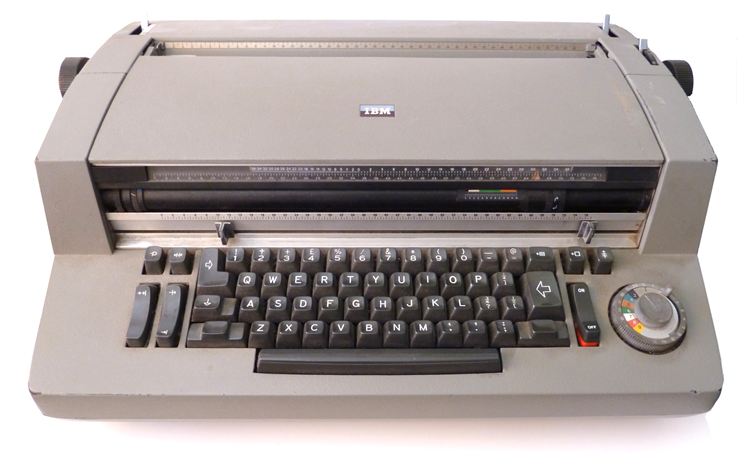
Ingenious, noisy, smelly, obsolete...
... yes, that would be the IBM Selectric Composer
In 1982, after seeing one for sale in Exchange & Mart, I spent all my savings and became the proud owner
of this second-hand IBM Selectric Composer (Serial No. 58007651). Please
don't call it a typewriter. Although it does look like a big old brute of an electric typewriter, and is in fact closely related to the Selectric Typewriter first made by IBM in 1961,
the Composer is a much more sophisticated creature: it produces proper proportionally-spaced composition. All characters on a typewriter – I, B and M, for example – are
typically mono-spaced, i.e. one unit wide, but the Composer gives 4, 7 and 9 units respectively.
The quality of its typesetting is really impressive because it is generated entirely by electro-mechanical means – the Composer has no electronic components at all. The machine
weighs nearly 3½ stone, makes a loud, rhythmic purring sound, and when the internal motor gets hot, it gives off a distinct whiff of lubricating oil. Using it was slow, laborious
work, but the end result – a very clean, sharp and inexpensive piece of ‘camera-ready’ typesetting – was always worth the effort.
I also like the fact that all of the Composer's twelve varied ‘typeball’ fonts were selected and customised by none other than
Adrian Frutiger (1928-2015), the hugely
influential creator in the 1950s of the Univers typeface family, probably the most rigorously rational and aesthetically harmonious invention in 20th-century typographic history.
So, although it is of course obsolete now, the Selectric Composer's design credentials are impeccable. At the height of its popularity in the 1970s, vast numbers of books, periodicals
and pamphlets (many of them issuing from ‘anti-establishment’ or ‘alternative’ presses) were set on a Composer. Even today, the distinctly unfashionable typographic
style of Private Eye (the British satirical newspaper), which was produced using an IBM Composer for at least two decades, still deliberately carries many traces of the unique
characteristics of Composer typesetting. ■
|